DEGREE SHOW CATALOGUE MA (2021)
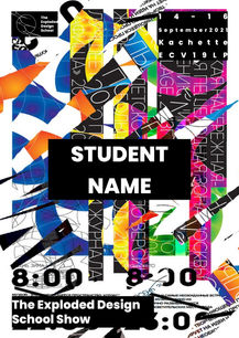
As part of our second semester at Kingston University, we were required to construct proposals and designs for either the physical show, online show or catalogue. We were required to participate in one for our end of year exhibition (degree show). We needed all three options, due to the coronavirus pandemic, with the threat of circumstances effecting a physical degree show. I chose to contribute in the creation of the catalogue design and show's visual identity; I was partnered with two fantastic colleagues. Together, over four weeks, we came up with a concept, visual identity, design, mockups and a digital catalogue. Our end of year show was called "The Exploded Design School Show", therefore this was what we based our visual identity designs from.
CONCEPT:
"Collecting something wonderful"
IDEA:
We collectively decided that we wanted to create a personalised catalogue. A catalogue that provided a way for the students and the audience to view and collect work that was based off of their interests. The idea behind this was that everyone would have a catalogue unique to themselves, resembling a limited edition for each person. This also meant that potential clients, employers or collaborators could identify and collect the work that they were interested in, simplifying the process for them to source specific designers they are looking for. Furthermore, we also wanted to have dedicated pages for each student, each being personal to them, which gave them options to choose how their page would become special to them.
SYSTEM:
We wanted to create a system that was an alternative to the usual alphabetical order method. We used LATCH to create different categories that each student's work fits into. We then used these categories to organise our catalogue.
THE CATALOGUE:
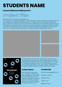
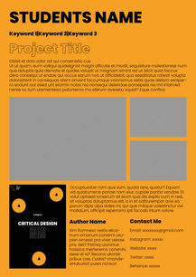
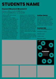
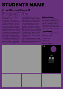
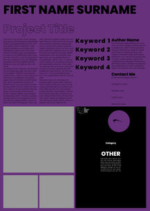
The catalogue was to be divided into pages on a wall, like an installation. The audience could collect them, storing in a provided booklet. Each student would have their own page, each varying in size. The size of the pages would be proportionate to the size of the student's work, giving the audience a perspective to the real-life scale. To make it fair to each student, the page's content would also be proportionate the page size. On the back would be a picture of the student's work, so that the audience has their very own poster collection to take home and use.
VISUAL IDENTITY:
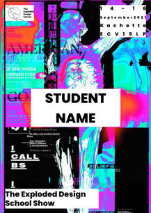
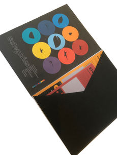
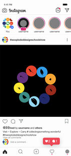
We came up with a logo that worked against different types of background. The logo split up into nine symbols, which we used for each category. It also represented the 'X' in 'exploded' whilst corresponding with the sparks, linking to the work exploded. Furthermore, we came up with a colour palette consisting of nine colours which represented the nine categories. We also chose two typefaces: Poppins and Futura.
DESIGNS:
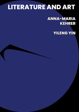
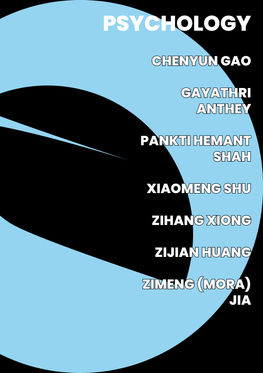
Our final designs included these core pages: The cover, contents, information pages (which gave details about the course, show and how to read the catalogue), course lecturer pages, guest speaker pages and pages about each category. Each category page gave the names of the students in the category, as well as the amount of students; this was represented through the symbols we created. These pages would automatically be provided in each catalogue, as we view them as the core essential pages to understand our concept, design and more about the show.
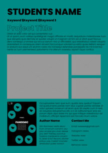
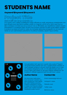
We then had the students pages. These come in A5, A4, A3 and A2. These are the pages that would be part of the installation. The A3 and A2 pages have a slightly different layout so they can be folded down to A4 and able to slide into the folder style catalogue.
MOCK UPS:
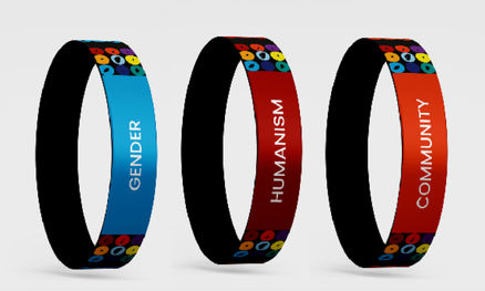
We went on to make mock ups in order to visualise what the product would actually look like. This consisted of digital mocks up and physical ones. We also made other items that corresponded with our designs, to be used in the exhibition.
DIGITAL:
Finally, we made a digital catalogue. This was due to us designing and studying during the Covid-19 pandemic. We wanted our work to still be viewable and showcased. We created a digital website mock up to show how we visualised the work coming to life and being successful.
This project was a competition, my work group was against two other fantastic designs for the catalogue. Our colleagues voted and unfortunately we lost out by a few votes. This meant our vision did not become a reality, however, it was a great opportunity to design the digital catalogue proposal, as I learnt many new skills and enjoyed working in a team. I believe my leadership, teamwork and organisational skills all came to the forefront during this experience.


